|
Читайте также: |
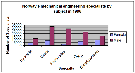

1. Approximately what percent of all Hydraulic specialists were males during 1996?
A. 15%.
B. 25%.
C. 50%.
D. 75%.
E. 90%.
The best answer is D.
Go to the hydraulic specialists bar, approximately 12,000 are males and 4,000 are females. 12,000 out of the total number of specialists in this category (16,000) is 75%, thus answer D is the best.
2. Which of the following category of mechanical engineering specialists had the lowest ratio between male and female workers in 1996?
A. Hydraulic.
B. Gears.
C. Pneumatics.
D. C.N.C.
E. Electrical erosion.
The best answer is E.
We are actually looking for a category where the bars of the males and the females are the closest. Another way is to calculate each of the ratios but it takes a long time.
By looking at the bars, we can easily notice that the females bar is relatively high in the electrical erosion category and the males bar is relatively low there. In that category the lowest ratio is accepted.
3. In 1996, approximately how many C.N.C specialists were between the age of 49 and 64?
A. 4,500.
B. 5,000.
C. 5,500.
D. 6,000.
E. 6,500.
The best answer is D.
First go to the bar chart and find how many C.N.C specialists were recorded in 1996, the answer to that is 30,000. By the pie chart we know that the required age group is 20% of the total and therefore the answer is (0.2 x 30,000 = 6,000) specialists.
4. If in 1996 all the Hydraulic specialists represented 5.5% of the entire mechanical specialists of Norway, approximately how many specialists were there total?
A. 120,000.
B. 180,000.
C. 240,000.
D. 260,000.
E. 290,000.
The best answer is E.
According to the bar-chart there are approximately (4,000 + 12,000 = 16,000) hydraulic specialists in Norway, which represent 5.5% of the total. 5.5% is a hard number to work with so play with it a little:  .
.
If we take 16,000 and divide it by 5.5% and also multiply by 100 we’ll get the total number of specialists in Norway.
 . Therefore answer E is the best.
5. If the number of female C.N.C specialists in the 28 to 35 years old category represents 4.5% of all C.N.C specialists, approximately how many male C.N.C specialists are also between 28 and 35?
A. 1,250.
B. 2,340.
C. 3,450.
D. 4,580.
E. There isn’t enough data.
The best answer is C.
15% of the specialists in the C.N.C category are between the ages of 28 and 35, if 4.5% are woman then the rest must be male, thus 11.5%.
All we need to calculate is 11.5% of the total number of C.N.C specialists.
According to the bar-chart, there are (7,000 + 23,000 = 30,000) specialists in that area of expertise. 11.5% of 30,000 can be easily calculated by dividing the 11.5 to 10% + 1% + 0.5%. The answer is C, 3,450 male specialists.
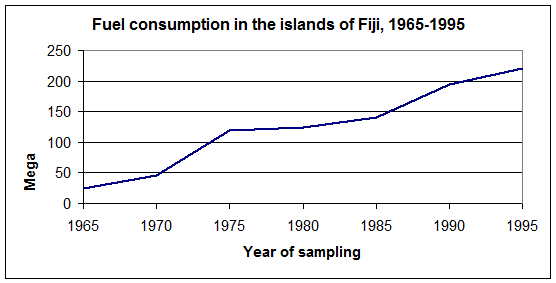

1. In which of the following years was the fuel consumption closest to 150 Mega-liters?
A. 1965.
B. 1970.
C. 1975.
D. 1980.
E. 1990.
The best answer is D.
In the year 1985 the fuel consumption was approximately 140 mega-liters but this is not one of the answers. The question specifically asked among one of the following years, thus the years presented as one of the answers. In 1980 the consumption was 125 and in 1990 it was 195 and therefore the closest year is 1980 and D is the best answer.
2. Which of the following years presented the lowest increase of consumption compared to the previous year of sampling?
A. 1970.
B. 1975.
C. 1980.
D. 1985.
E. 1990.
The best answer is C.
With our calculating anything, we can easily see that between 1975 and 1980 the line is almost horizontal. The angle of the line relative to the year axis represents the degree of change in the consumption. Since the line has the lowest inclination between these years, 1980 is the year we are looking for.
3. In 1985, how many of the categories shown use greater than 25 mega-liters?
A. 0.
B. 1.
C. 2.
D. 3.
E. 4.
The best answer is C.
Using the graph we can conclude that in 1985 approximately 140 mega-liters of fuel were consumed. 25 mega-liters are approximately a little under 20% (17%). Look in the bar-chart in the year 1985 for categories that surpass 20% of fuel.
The only categories that fit the description are Private cars and industrial, thus two categories among the categories shown.
4. In 1965, approximately how many mega-liters are consumed by industrial use only?
A. 10.
B. 15.
C. 20.
D. 25.
E. 30.
The best answer is C.
Go to the bar-chart, you can see that 80% of the total fuel consumption goes to industrial use only. In the year 1965, according to the graph, approximately 25 mega-liters are consumed and therefore 80% of 25, which is 20 mega-liters, goes to industrial use.
5. In which of the following years was the consumption of the public transportation the greatest?
A. 1995.
B. 1985.
C. 1975.
D. 1965.
E. There isn’t enough data.
The best answer is A.
There are two ways to answer this question, the first is to calculate all the necessary numbers and the second is to evaluate.
We can see that the bars of the public transportation are nearly even yet the line chart is inclining as the years go. The highest fuel consumption would be in the latest year, thus 1995. The consumption there is approximately 25% of 220, which are 55.
If you look up close you’ll also notice that the 1995 bar is the greatest and therefore answer A is undoubted.
6. In which of the following years was the consumption of the industrial use the greatest?
A. 1995.
B. 1985.
C. 1975.
D. 1965.
E. Answers B and C.
The best answer is C.
This time the only way is to find the real consumptions in each year.
Use both the line chart and the bar graph to answer this question.
In 1995- 15% out of 220, which is 33.
In 1985- 35% out of 140, which is 49.
In 1975- 60% out of 120, which is 72.
In 1965- 80% out of 25, which is 20.
The largest industrial consumption is in the year 1975.
7. If the number of cars grew by 30% between the years 1972 and 1975, what was the fuel consumption in the year 1972?
A. 65.
B. 72.
C. 84.
D. 93.
E. It cannot be determined from the information given.
The best answer is E.
We don’t know the connection between the number of cars to the fuel consumption. Although this correlation seems logical, this is not the place to work by intuition.
The answer is E because more sufficient data is required.
8. Which of the following can be inferred form the graphs?
A. The fuel consumption of private cars increased from 1965 to 1995.
B. The fuel consumption of public transportation in 1985 is larger than that in 1975.
C. New roads were built due to the increase in the number of cars between 1965 and 1975.
D. Answers A and B.
E. Answers A, B and C.
The best answer is A.
Check all the answers.
A- The fuel consumption in 1995 was much higher than in 1965 according to the line chart. B- The public transportation fuel consumption in 1985 was 21 while in 1975 it was 24, thus B is incorrect which leaves us with answer A by itself.
9. Assume that there were 2,800 private cars in the year 1985 in the Fiji islands. What is the average fuel consumption per car (in liters)?
A. 6,500.
B. 8,200.
C. 10,000.
D. 12,500.
E. It cannot be determined from the information given.
The best answer is C.
In 1985, approximately 140 mega-liters were consumed. 20% of that amount goes to private cars (0.2 x 140 = 28). That is 28 million liters of fuel.
28 million divided to 2,800 is 10,000 liters per car and thus C is correct.


1. How many of the presented car systems cost more than a thousand dollars to produce?
The best answer is E.
This is an easy question, go to the graph that presents the price of production and see how many categories are over a $1000- the answer is 5, all but the last.
2. How many of the car systems cost more than $1,500 and took more than 7 hours to produce?
The best answer is B.
In this question you need to use both graphs. From the first graph (the money graph), you can see that the only systems that surpass $1,500 are the first two. Now go to the second graph and see how much time it takes to produce each of the two systems. The only system which answers both categories is the Engine Machinery system.
3. Approximately how many more minutes does it take to produce the internal design system than the Electric system?
The best answer is C.
Go to the relevant graph. The difference between the bars of the internal design system to the electric system is approximately 0.5 hour, which is 30 minutes and therefore answer C is the best.
4. What is the ratio between the cost of two radiator and cooling systems to a system of engine machinery?
The best answer is A.
According to the graph with the cost data, the price of a radiator and cooling system is approximately $750 and the price of the engine system is $4500.
The ratio between two radiator systems to one engine systems is the ratio between 1500 and 4500, which is 1:3.
5. Approximately what is the average cost of the two median systems?
(Median in terms of cost)?
The best answer is B.
The median systems are the ones that have two more expansive systems and two less expansive systems. Look for two bars that have two bars smaller and two bars larger than them. The two median systems are the Tinsmith’s work and the internal design.
The average is (1700 + 1400)/2 = 1550.
6. Approximately what percent of the entire cost of the car is the cost of the engine machinery system?
The best answer is D.
Refer to the cost graph; the cost of the engine system is $4,500.
Sum up all of the other systems, including that of the engine, to get approximately $12,000 as the cost of the entire car. 4500 out of 12000 is approximately 38% and therefore answer D is the best.
7. Approximately what percent of the total does it take to produce the electricity system and the steering system?
The best answer is C.
Add the two relevant bars; the time it will take to produce them is (7.5 + 6.5 = 14 hours).
Add all the systems up; the result is approximately 43 hours.
14 out of 43 are approximately 32% and thus C is the closest answer.
8. Which of the following systems has the lowest ratio between time and cost of production?
The best answer is C.
There is no other way, check the approximate ratio in each of the categories.
And therefore the closest ratio is C.
9. If there are 87 working hours per day in the factory of car X, approximately how many cars can be manufactured in 3 days?
The best answer is C.
If you sum up the entire time of building a car, you’ll get approximately 43.5 hours.
If there are 87 working hours in one day then two cars can be made, thus 6 cars can be manufactured in 3 days.


1. Approximately what percent of all appliances sold in the Arnolds electric store were Ovens and televisions?
The best answer is C.
In this question you’ll need to use the data from both graphs.
Sum up the bars of both the ovens and the televisions. They both sum up to 58.
Sum up the bars of all the appliances in all the categories, they will sum up to approximately 200 or so. Now, 58 out of 200 are a little under 30% and therefore answer C is the best answer.
2. If X represents the number of DVD’s that were made in U.S and were sold during December, how many Televisions that were made in the China sold that month?
A. X.
B. 1.5X.
C. 2X.
D. X/2.
E. 6X.
The best answer is E.
According to the bar chart, X represents approximately 5 DVD’s that were sold.
Go to the T.V category, you can see that approximately 30 televisions that were made in china were sold in December and therefore the answer is 30/5 = 6X.
3. For the individual category in which the second greatest number of appliances made in the U.S were sold, the number of appliances made in the U.S exceeded the number of appliances made in China by how much approximately?
The best answer is C.
First identify the category in which the number of appliances made the U.S is the second in size, which would have to be the “ovens” category. In that category 14 (U.S) ovens were sold and (China) 12 ovens were sold. The difference is 2 ovens and therefore the answer is C.
4. According to the graph, to which of the following categories was the ratio between appliances that were made in China to appliances that were made in the U.S the greatest?
The best answer is
Check the approximate ratio in each of the options:
And therefore the greatest ratio will be in the Televisions categories.


Дата добавления: 2015-09-10; просмотров: 89 | Поможем написать вашу работу | Нарушение авторских прав |